

Designing the look of the book
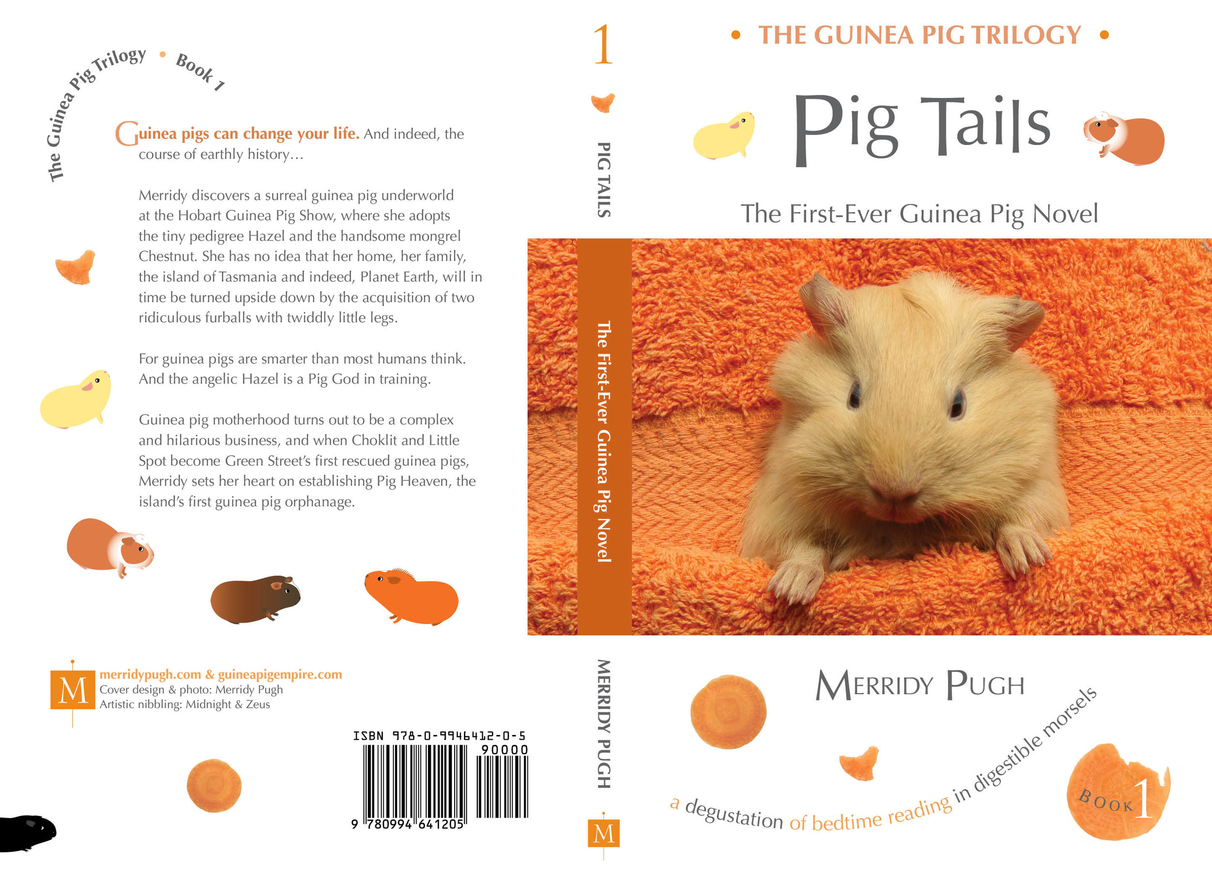
/Pig Tails: The First-Ever Guinea Pig Novel is Book 1 of a fiction series for adults – The Guinea Pig Trilogy. The story is warm, quirky and humorous.
(If you haven't read it yet, Hazel says, get on with the job!)
My challenge as the book designer was to come up with something appealing and in line with my professional approach to communication, which is simplicity, clarity, precision.
(Hazel, shh! I have my professional book designer's hat on!)
The book design needed to reflect the subject matter, genre and tone of Pig Tails, and be usable for Books 2 and 3.
(Yes, Hazel, and 4, if you so desire!)
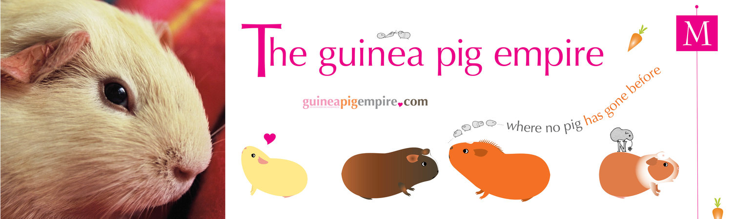
I also wanted the book design to point to the larger world of The Guinea Pig Empire, of which the Trilogy is a part.
(Yes, Hazel, and of which you are the boss!)
The book design is thus a marketing vehicle which extends beyond the particular book.
(Jolly good professional phrasing, if I do say so myself.)
To do these things I chose:
• A cover photograph and photographic elements (carrot coins) that reflect the humour and style of Pig Tails, its intended function (bedtime reading in digestible morsels), that the characters are based on real-world guinea pigs, and that the narrative is firmly grounded in daily life. The carrot coins, by the way, are ‘artistically nibbled’ by real-life guinea pigs, but not by Hazel, who was in a parallel universe deeply engrossed in bran worms.
• Small digital cartoon renditions of the guinea pig characters, which point to the forthcoming picture books (Guinea Pig Empire Books For Kids), Apple emoji sticker packages and other merchandise. The first sticker pack has 20 adorable renditions of Hazel himself.
• My professional business logo on back cover and spine (the ‘M) linking to my credentials as an editor, writer and designer at merridypugh.com. It's hard to look professional with a bossy guinea pig interrupting, but I do my best!
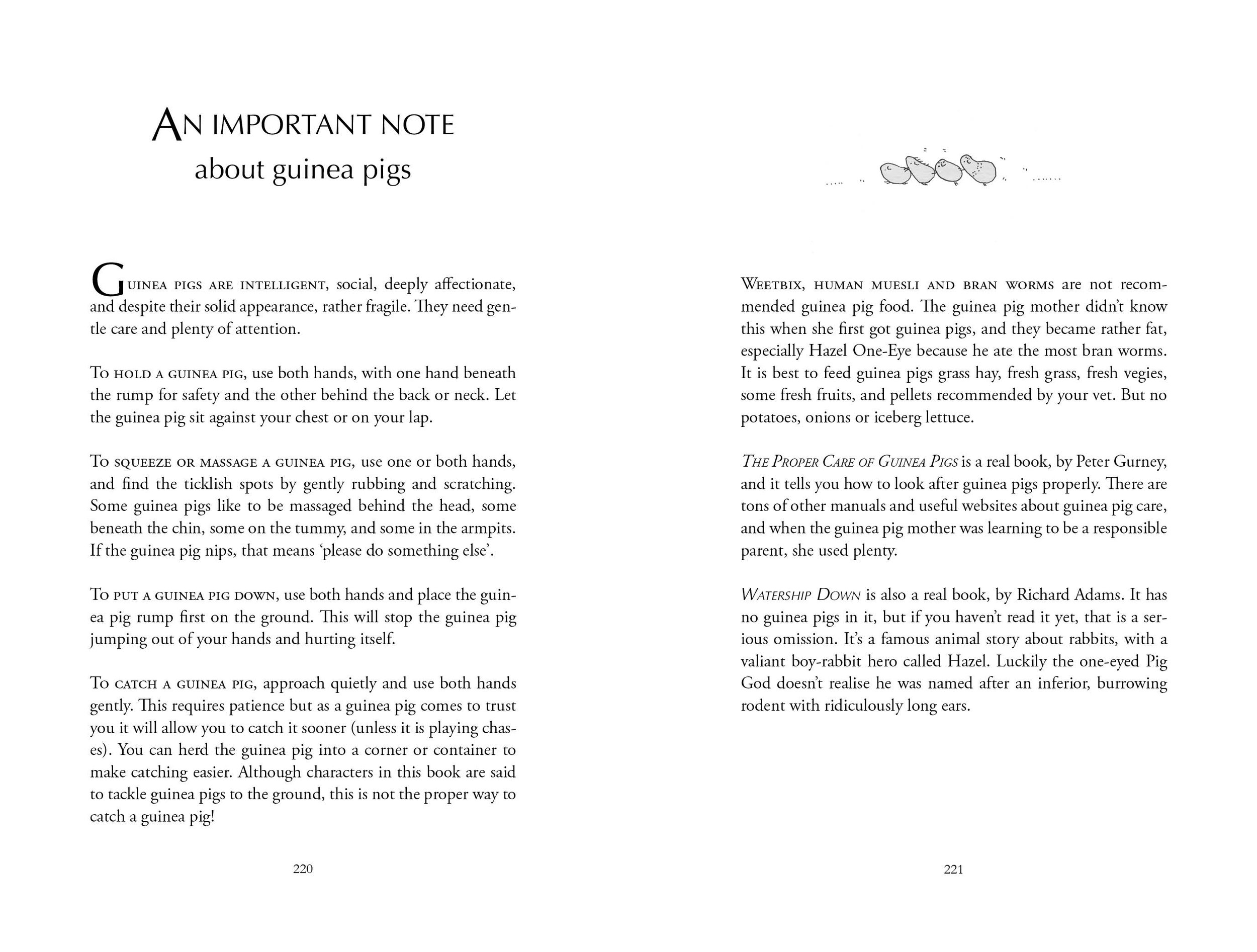
• Pen and ink sketches inside to add interest, playfulness and point to another artwork style available on Empire merchandise.
The design will be the same for other books in the series, each with a separate colour scheme. The spines will line up on the shelf and be distinct – Book 1 orange, Book 2 turquoise, Book 3 magenta.
(Hazel, patience! I haven't got to Book 4 yet!)